

The same border can look completely different at eight in the morning and again at six in the evening, and not just because the light has changed direction. Color and texture shift how a space reads depending on the angle of the sun, and a garden designed without accounting for that only ever looks right at one time of day. Color and texture together do more to shape a garden’s mood than the plant list itself, since the same species arranged differently can feel either calm or chaotic.
Warm colors such as reds, oranges and yellows energize a space and suit social areas, while cool tones like blues, purples and silvery foliage calm a space and suit quiet corners, and layered plant textures add the sensory depth that color alone cannot provide. Getting this balance right matters more in small gardens, where every plant carries proportionally more visual weight.
- Warm tones (red, orange, yellow) suit gathering spaces; cool tones (blue, purple, silver-green) suit reflective corners.
- Bees show a documented preference for blue and violet flowers, a factor worth weighing in any pollinator-friendly border.
- Texture contrast, fine grasses against broad-leaved plants, adds depth that color alone cannot achieve.
- Shifting daylight changes how both color and texture read across a single day.
How warm and cool color palettes change a garden’s mood
Color in a garden works the same way it does in interior design, just with a living, changing palette instead of a fixed one. Warm tones, reds, oranges, yellows, read as energetic and inviting, which is why they suit entertaining areas, garden parties and spaces meant to feel lively. Cool tones, blues, purples, silver-toned foliage, produce the opposite effect, introducing calm and making them well suited to meditation corners or quiet seating.
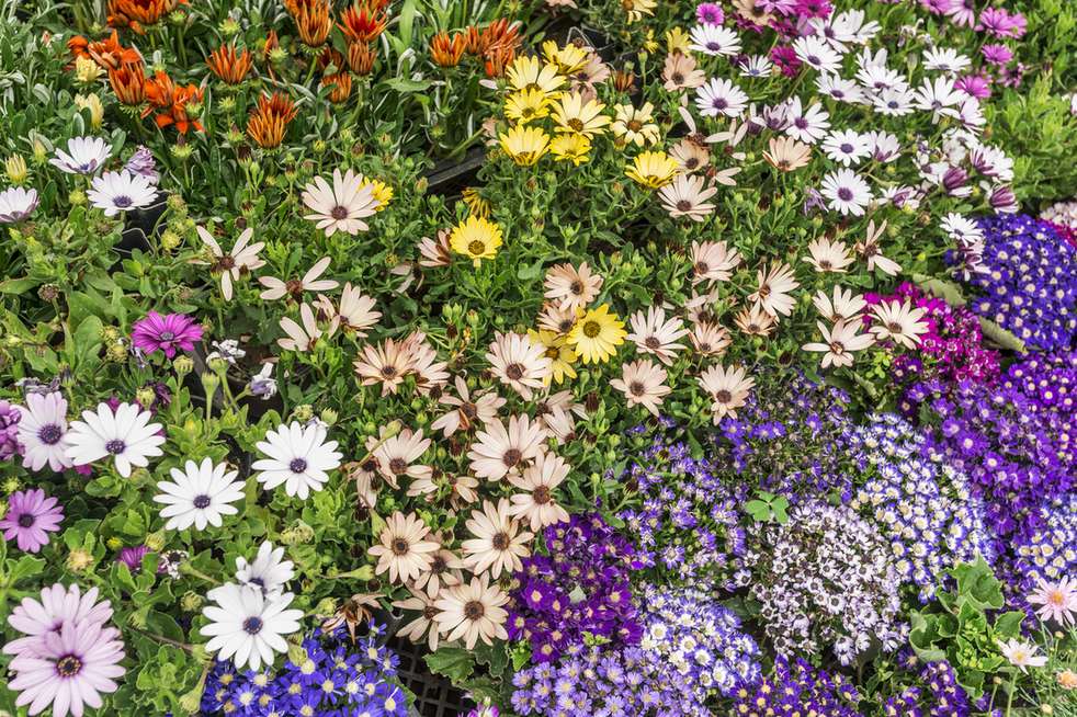
Foliage color carries as much weight as flower color in this equation, and it lasts far longer through the season. A planting scheme built entirely around dark, moody greens will read as calmer and cooler than one built around bright, citrus-toned foliage, independent of whatever flowers bloom on top of it. Balancing a few bold color accents against a larger base of neutral or green tones keeps a garden from feeling either flat or overwhelming.
Why texture matters as much as color
Texture engages a different sense than color does, inviting touch as much as sight. The soft, felted leaves of lamb’s ear read completely differently against a hand than the rough bark of an oak, and a garden that uses only one texture register, all soft, all spiky, all smooth, tends to feel monotonous no matter how varied its color scheme is.
Contrasting textures do the visual work that color alone cannot. Fine, feathery ornamental grasses next to the plump, geometric shapes of succulents create a dynamic pairing that reads as considered rather than accidental. Ferns, with their lace-like foliage, work the same way against the bold, simple leaves of hostas or bergenia.
Texture also interacts with light in ways color does not. As the sun moves across the sky, it casts shadows through textured foliage that shift throughout the day, meaning a border can look soft and diffuse in the morning and sharply defined by late afternoon.
Designing color choices with pollinators in mind
Color choice is not purely an aesthetic decision if a garden is also meant to support pollinators. Research summarized by Penn State Extension shows bees have a pronounced innate preference for blue and purple flowers, tied to their color vision being most sensitive in the ultraviolet, blue and green wavelengths and far less responsive to red. A border heavy on blues, purples and violets is likely to draw more bee activity than one dominated by red tones alone, though red and orange flowers still attract other pollinators such as certain butterflies and hummingbirds.
This does not mean abandoning warm colors in a pollinator-conscious design. It means treating blue and purple as a deliberate inclusion rather than an afterthought, particularly in any bed meant to double as habitat.
Using color to organize different zones of a garden
Color can function as a wayfinding tool as much as a decorative one. Bright, saturated tones naturally draw the eye and can mark an entertaining area or a focal point, while softer pastel tones signal a more contemplative zone without needing a physical barrier to make the distinction. This lets a single garden hold multiple moods without feeling disjointed, as long as a transition zone of neutral green softens the shift between the two color registers.
Color and texture combinations by garden mood
| Desired mood | Color palette | Texture pairing |
|---|---|---|
| Lively, social | Reds, oranges, warm yellows | Bold leaves, glossy foliage |
| Calm, reflective | Blues, purples, silver-green | Fine grasses, soft felted leaves |
| Pollinator-friendly | Blues, violets, with some yellow | Open, single-flowered forms |
The same color and texture logic needs to hold up once the sun goes down, since a garden used in the evening is read under a completely different kind of light. A closer look at how the same palette reads under garden lighting after dark covers how warm and cool tones shift under artificial light, and why a color scheme that works in daylight sometimes needs adjusting for evening use.
FAQ
Can I mix warm and cool colors in the same garden?
Yes, most successful gardens use both, dividing them into distinct zones rather than blending them evenly. A neutral green transition area between a warm zone and a cool zone keeps the shift from feeling abrupt.
What is the easiest way to add texture without changing my color scheme?
Introduce plants with a different leaf shape or surface than what already dominates the bed, such as adding fine ornamental grasses to a border of broad-leaved perennials, without changing the flower colors already in place.
Do seasonal changes affect color and texture planning?
Significantly. Spring and summer bring saturated bloom colors and lush foliage texture, while autumn shifts the palette toward warm tones through foliage change rather than flowers, and winter relies almost entirely on texture and structure once color fades.
Should I prioritize color or texture when starting a new border?
Texture first, since it provides the structural backbone that holds a border together once flowers fade. Color can then be layered on top through seasonal bulbs, annuals and perennial blooms.
Color fades and returns with the seasons, but texture holds a garden together through every stage in between. A border planned around both, rather than color alone, keeps offering something to look at even in the months when nothing is in bloom.
Sources: Penn State Extension, pollinator color preference research.